Monday, January 29, 2018

Revision #1 Cover

The first revision that I made on my magazine were on the cover. What I did was that I expanded the whole picture to the edge of the canvas. Now that the picture is larger I had to adjust the title and all the text within the picture to a bigger size. When doing so, I rearrange some of my article blips, for example, in my first draft "Saks Fifth Avenue" in "Saks Fifth Avenue making a difference in the community" is positioned all in one line, in my newly revised version, "Saks Fifth" is stacked on top of "Avenue." This made the magazine cover more empty space. Overall, the main fix of the cover was to expand the picture to get rid of the thick white border as seen below.
New: top
Old: bottom


Wednesday, January 24, 2018

Feedback/ Revisions

The feedback that I received about my magazine were very small fixes that involve the border of my magazine and my article. The system that I used to create my magazine was Microsoft Publisher. Publisher provided a border that is smaller than the actual 8 x 11 size page. What I did was that I put all my content within the border and when it came time to present my magazine each page showed a thick white border that surrounded my actual magazine. Not knowing this will happen I still received a complement about the white border. What I'm still going to do is expand all my content to the edge of the page, doing this I will have to adjust everything to a bigger size.

On the second page of my article I included a quote that laid in the middle of to columns of text. The problem was that it was very hard to see the quote because there was little contrast between the main article text and the quote's text. What I will possibly do is either change the size quote or make it a different color so it s easier to see.

Tuesday, January 23, 2018

Use of Conventions/ social groups

During my research of magazines I picked up a few key features that appeared mostly on all of them. Magazines such as GQ place their title at the top left corner, and magazines such as Vanity Fair placed their title centered at the top. Of the magazines that I researched most of the article blips on the cover were position on the sides of the featured model of the magazine. For the cover that created I used the technique GQ used by placing my title at the top left corner, I also placed my article blips on the sides of my model like how most magazines do. For the table contents, I tried to challenge conventions rather than stick with them as shown below.


What I did was that I positioned and sized my pictures to stack from smallest to largest to make it appear like stairs. I also made the page number of where the articles can be found very large.

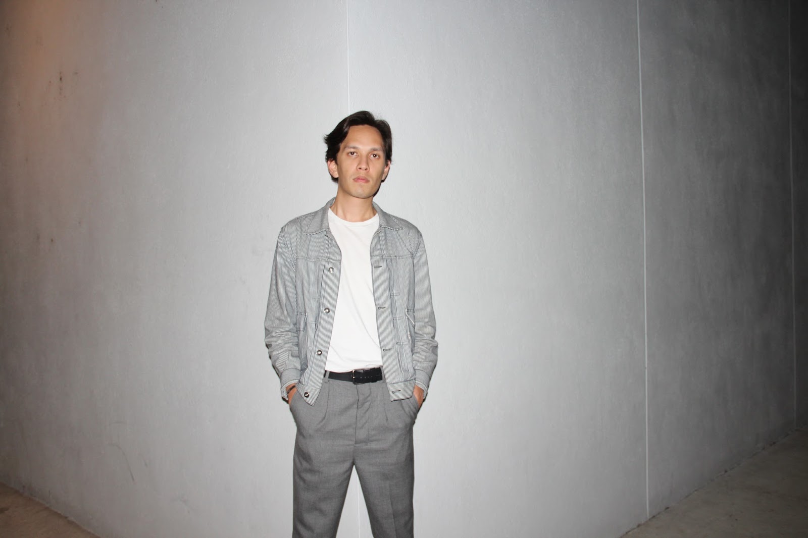
For my article I stuck to conventions by placing a dominate picture that covers about 25% of the page and placing the text below it.

Social groups that maybe attracted to my magazine are people who like to keep up with new trends of clothing. 

Monday, January 8, 2018

Scheduling Photo shoots

Scheduling photo shoots for my magazine was a bit difficult. There were a lot of issues with timing were I would have a busy schedule and the person I am taking pictures of also has a busy schedule. Or, there will also be situations were I have a clear schedule but the person I'm working with is busy and vice versa. I only had one main big photo shoot and it was at night time so there were  difficulties in finding good lighting. These are the best pictures I captured:


Magazine Flat Plan

Based on my research of magazines, advertisements cover at least half the magazine. For my magazine there will be 48 pages of advertisements and 38 pages of articles. The articles I came up with that I am not going to create are mostly about fashion trends such as what to wear in different seasons of the year. The articles are from 2-4 pages long and advertisements 3-5 pages long.